The Desktop Flaunt (!)
Posted on by Yuen Hoe
Hi, this is Yuen Hoe here, and I’m supposed to be kicking off this new monthly desktop screeny thing. So the basic idea is simple, every month we’ll be having a Linux box over to powder up and pose for the printscreen. We’ll click a couple of shots, then upload and flash them here in what would hopefully be a showcase of glamour. Presumably this would serve on the one hand to give fellow Linux users tips and inspirations with regards to customizing your own box, and on the other to make you infidelic non-Linuxers drool in uncontrollable envy educate the masses that modern Linux can be as polished as any other graphical OS - because we all know that people only care about looks a pretty and refined GUI goes a long way :)
So without further ado…
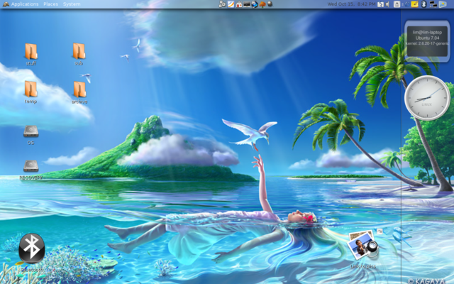
It so happened that this period sees me in “let’s make things look Vista-ish!” mood, so purists will have to bear with me ;) I am pretty happy with the extent to which I was able to reproduce Aero-Vista’s glassy feel though, especially considering the fact that both my Compiz reflection and blur plugins refuse to work.
And since nobody told me that it’s supposed be a ONE screenshot post, I’m gonna flaunt a good deal moar - after all, you can never do a Linux desktop justice with only one screeny.
More screenies after the cut. Warning : they’re huge!
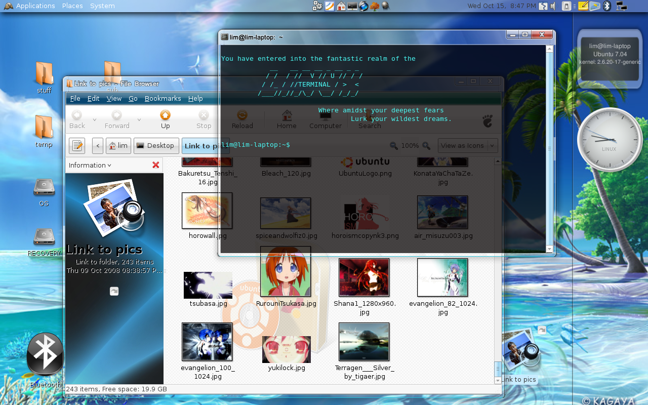
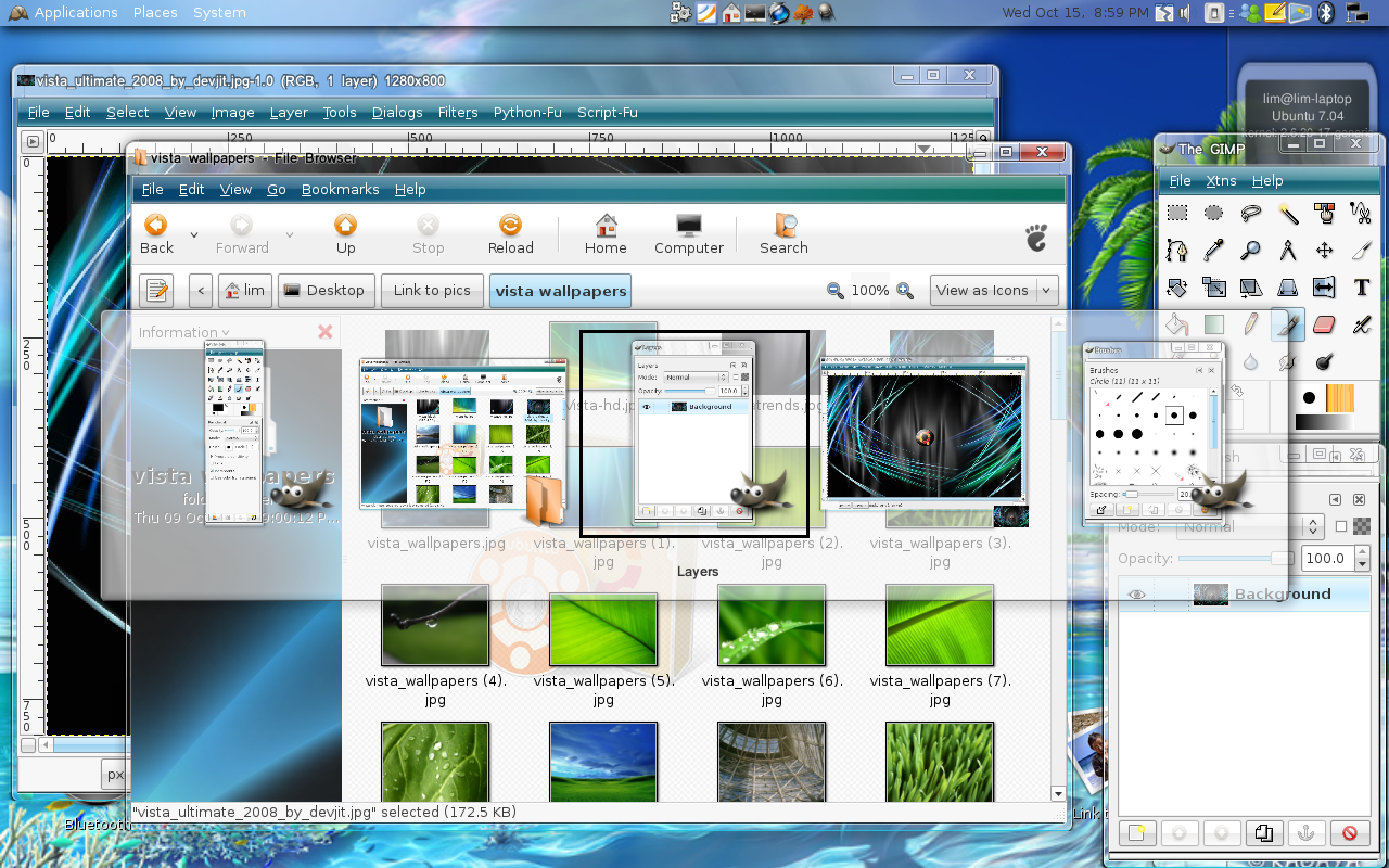
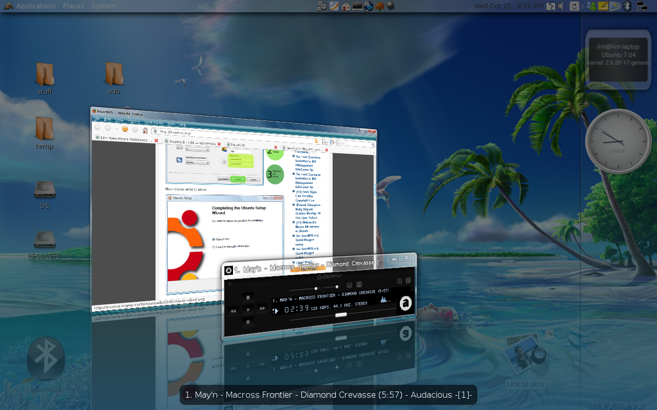
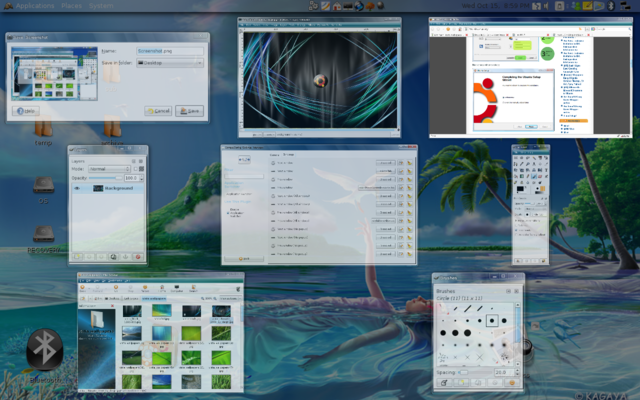
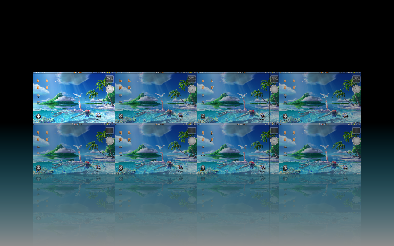
As a final note, while its cool to Vista-ify or Mac-ify your desktop every now and then, its usually more fun and rewarding to try for something more unique. For example, I once achieved a very satisfying result with trying for a Ubuntu-ish look by theming everything in black and shades of polished orange. The point is that if you are willing to spend some time experimenting with the theming mechanisms, it’s really not difficult to synthesize something that looks like no other familiar system, that looks impressive and awesome all the same. Your creativity is the limit.
Have fun!